A ground-up UX and product design of a B2B SaaS platform enabling schools, associations, and organizations to deliver weekly personalized audio episodes, built entirely without a direct competitor to reference.
IMPACT
350+
Screens designed, ~200 admin panel, ~150 subscriber web app
Live
Fully deployed and serving real organizations exactly as envisioned
0 → 1
Built with no direct competitor to reference, first of its kind in the category
CONTEXT
A product category that didn't exist yet, built from a brief
The client is a US-based communication technology company with a simple but powerful insight: emails go unread, videos go unwatched, and podcasts are too long. Schools, associations, and organizations were struggling to get their message heard by the people who mattered most.
Their solution was a platform letting leaders record short audio messages, tag them for specific audiences, and auto-assemble them into weekly personalized episodes delivered via SMS, email, and push notification. Every listener hears only what's meant for them, and leaders can see exactly who listened and for how long.
The challenge: no comparable product existed in the market. There was no UI pattern to borrow, no direct competitor to audit. We were designing vocabulary, mental models, and interaction patterns from zero, working from a client brief and close collaboration with their team.
USER & THEIR NEEDS
Two very different users. One connected system.
The product serves two distinct user groups with fundamentally different needs and mental models, both served by the same underlying platform.
Admin Side, Organization Users
PAIN
Managing audio content across multiple segments, subsidiaries, and weekly deadlines is complex and error-prone without a structured system.
CONSEQUENCES
Episodes go out with missing segments, wrong content for the wrong audience, or delayed by approval bottlenecks.
NEED
A structured workflow for building episode templates, submitting audio, tracking tasks, and scheduling delivery, all in one place.
Subscriber Side, End Users
PAIN
Communication from schools and organizations is fragmented, lost in email inboxes, ignored newsletters, and long-form content nobody has time for.
CONSEQUENCES
Important updates are missed, trust in leadership communication erodes, and organizational participation weakens.
NEED
A frictionless way to receive short, relevant, personalized audio from their organization, on their own schedule.
THE PROBLEM
Five design problems that had no existing answer
01
No mental model existed for this product
With no direct competitor, users had no frame of reference. Every interaction pattern, from building a template to scheduling an episode, had to be invented and made intuitive from scratch.
02
The Assembler was an entirely new interaction paradigm
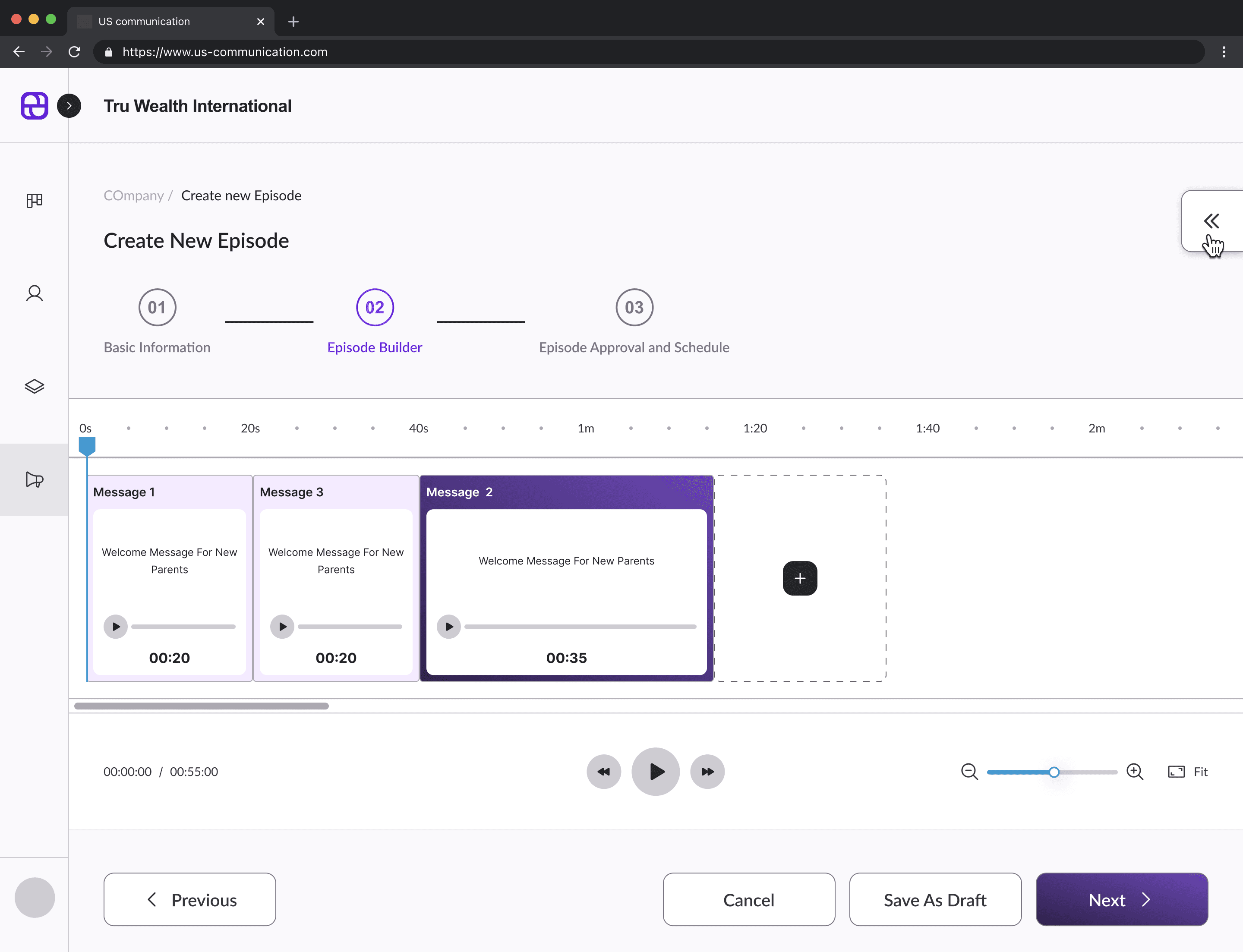
Building a multi-component episode timeline with Audio Segments, Dynamic Blocks, Channels, Musical Transitions, and Background Music required designing a configure interface with no precedent in the space.
03
Personalization logic was invisible and hard to communicate
The core value, each subscriber hears only what's meant for them, is backend logic that needed to be surfaced clearly in the UI so admins could understand, configure, and trust it.
04
Multi-role, multi-subsidiary complexity
A single organization might have multiple subsidiaries, multiple user roles, and multiple clients, all with different permissions, views, and task flows that needed to coexist coherently.
05
The Scheduler needed to surface missing content before it became a problem
Episodes publish weekly. If audio is missing for a segment, the episode fails. The Scheduler had to make visible what was pending, who was responsible, and when the deadline was, across weeks of upcoming episodes at once.
DESIGN PROCESS
Requirements to reality, four months, ground up
With no competitor to benchmark against, our process leaned heavily on requirements translation, close client collaboration, and progressive refinement of mental models before a single hi-fi screen was produced.
PHASE 1
Deep brief analysis & requirements mapping
The client came with a clear product vision but no UI direction. I spent the first phase breaking down every requirement, what the platform needed to do, who would do it, in what order, and mapping these into a complete feature set before touching any design tool.
PHASE 2
User journey mapping, both surfaces
Mapped the full journey for both user types: the admin building and managing episodes, and the subscriber receiving and listening. Identified critical paths, decision points, and moments where the product's unique value needed to be made visible in the UI.
PHASE 3
Design system, built before screens
Built a complete design system before designing a single product screen. Primary blue (#4598CF), secondary red (#EB565C), tertiary navy, and quinary amber, each mapped to functional contexts. Custom component library covering buttons, inputs, tables, popups, audio players, status indicators, and the custom scheduler grid.
Primary Blue
Primary Red
Tertiary Navy
Quinary Amber
PHASE 4
Information architecture & navigation
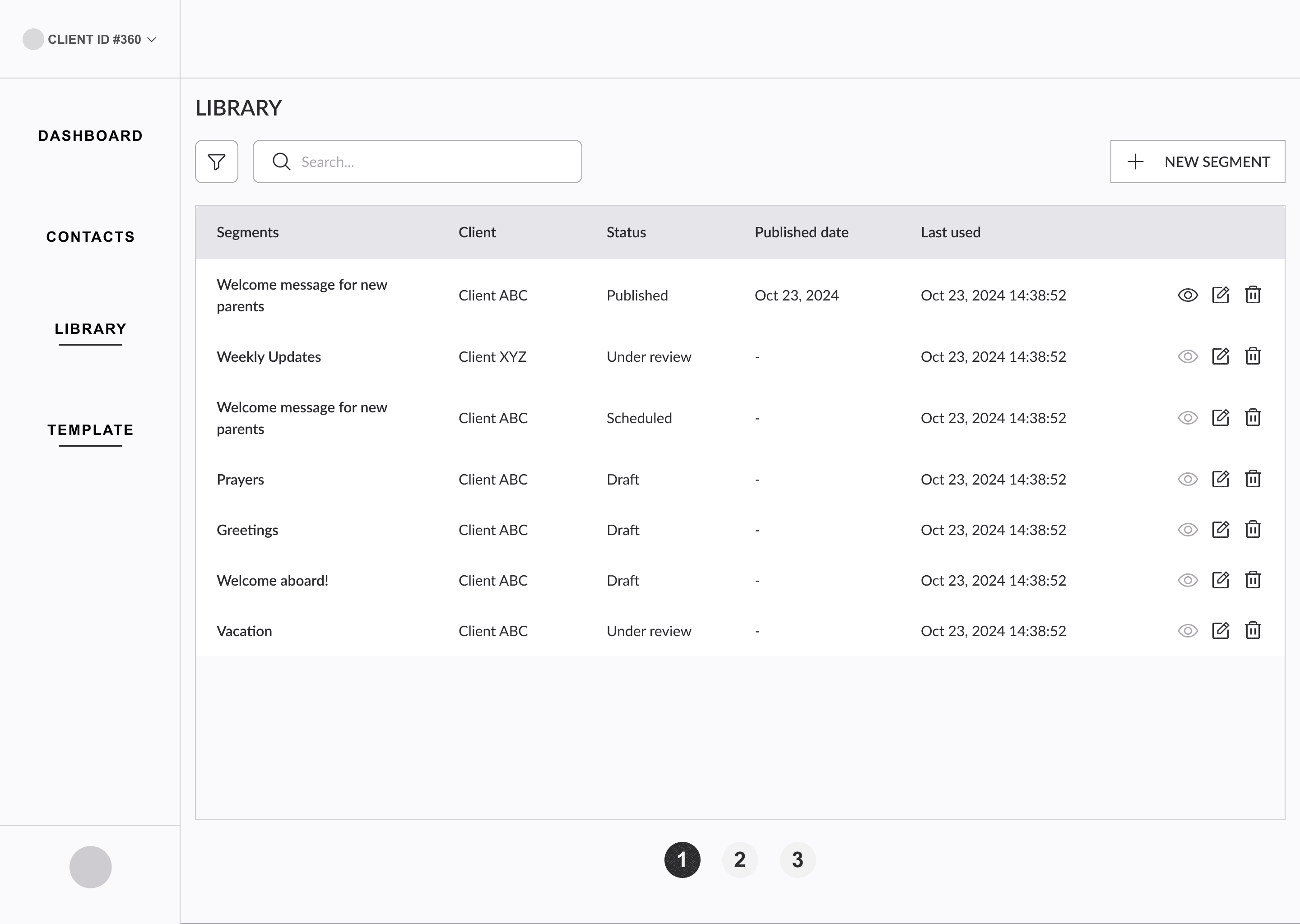
Designed separate navigation structures for the ZipCast admin (Dashboard, Clients, Library, Scheduler, Assembler, Task Manager, Giveaway, Prospects) and client admin (Scheduler, Library, Task Manager, Users, Subsidiaries, Settings, Subscribers, Profile). Each carefully scoped to show only what each role needed.
PHASE 6
High-fidelity design, admin panel first
Designed the ~200-screen admin panel across all modules, starting with the most complex (Assembler and Scheduler) to establish patterns, then rolling those patterns through remaining modules. Every screen includes real data, edge cases, empty states, and loading states.
PHASE 7
Subscriber web app, responsive design
Designed the ~150-screen subscriber-facing web app with full responsive layouts, the experience listeners use to receive and play their personalized episodes. Optimized for ease: minimal steps from notification to playing the episode.
PHASE 8
Developer handoff & QA support
Prepared complete handoff documentation, component specs, interaction notes, state definitions, and edge case annotations. Supported the development team through the build phase to ensure fidelity to the designed experience.
DESIGN SOLUTION
Five surfaces.
One coherent product.
The platform needed to serve multiple user types, handle complex audio assembly logic, and make personalization visible, all without overwhelming users who had never seen a product like this before.
01
The Assembler, a timeline-based episode builder
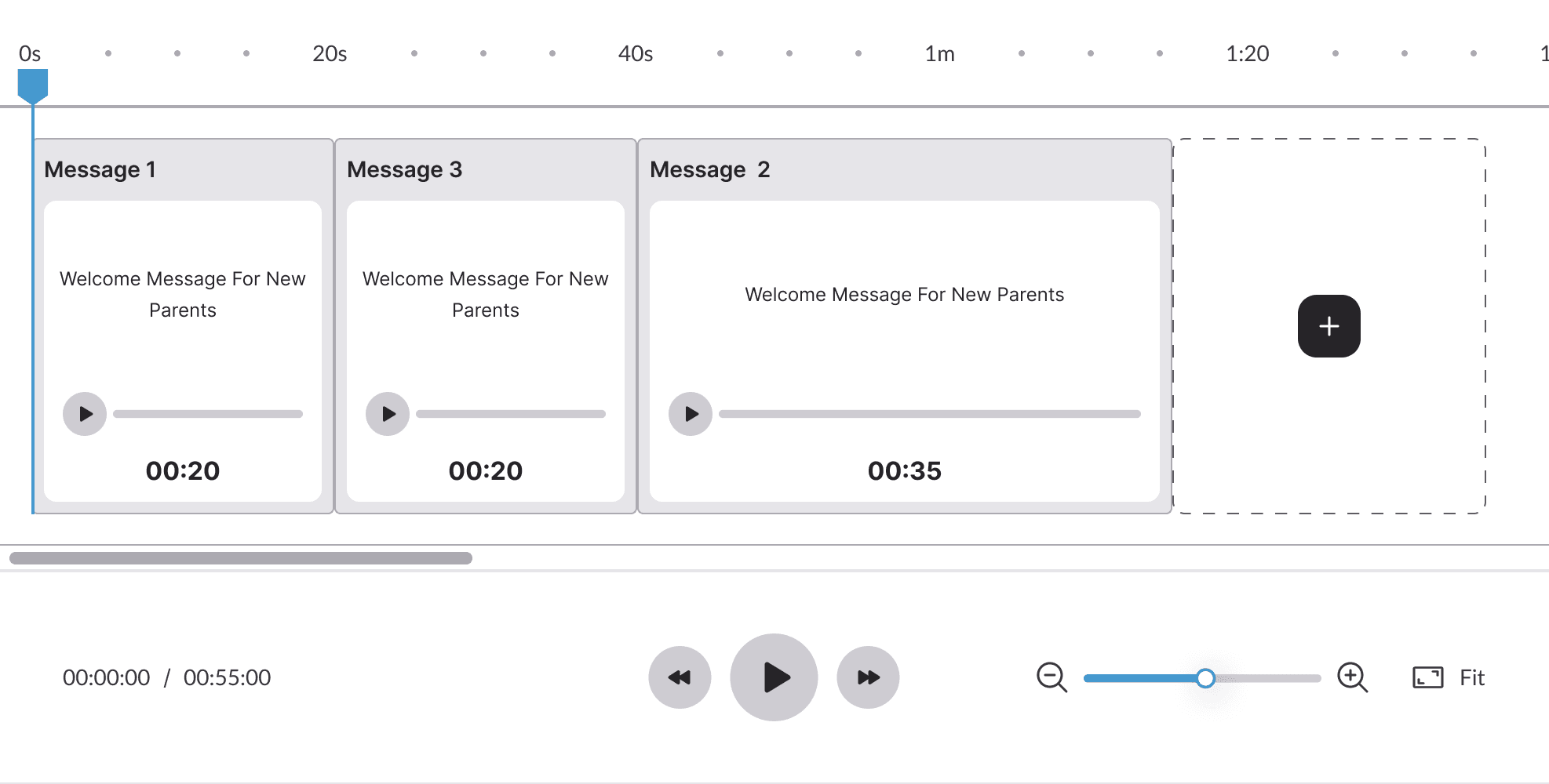
The most complex and novel feature of the product. Admins build episode templates by adding components to a visual timeline, Audio Segments, Dynamic Blocks, Channels, Musical Transitions, and Background Music. Each component has its own configuration panel, audio connection, and status state. The challenge was making this feel approachable despite its underlying complexity.
02
The Scheduler, weekly episode grid with segment-level tracking
A multi-week grid where each column is an upcoming episode and each row is a content component. At a glance, admins can see the status of every segment across every upcoming episode, Not Started, Content Pending, Approved, Postponed, Skipped. Missing content is immediately visible before it becomes a delivery problem. Content directors and ZipCast admins get different perspectives of the same data.
03
The Task Manager, turning content gaps into actionable tasks
When a segment needs audio content, the system automatically generates a task assigned to the right person. Content submitters use it to upload audio. Reviewers provide timestamped feedback. The AI voice generation tool ("Zipify") is accessible directly from within tasks, allowing teams to generate audio from text when no recording is available.
04
Client & subsidiary management, multi-org at scale
Admins manage multiple client organizations simultaneously. Each client has its own profile, subsidiaries, users with distinct roles, subscribers with preferences, and blackout dates. Clear breadcrumbs, inline editing, confirmation flows, and deactivation states keep complex multi-org management from feeling overwhelming.
05
The subscriber web app, frictionless listening experience
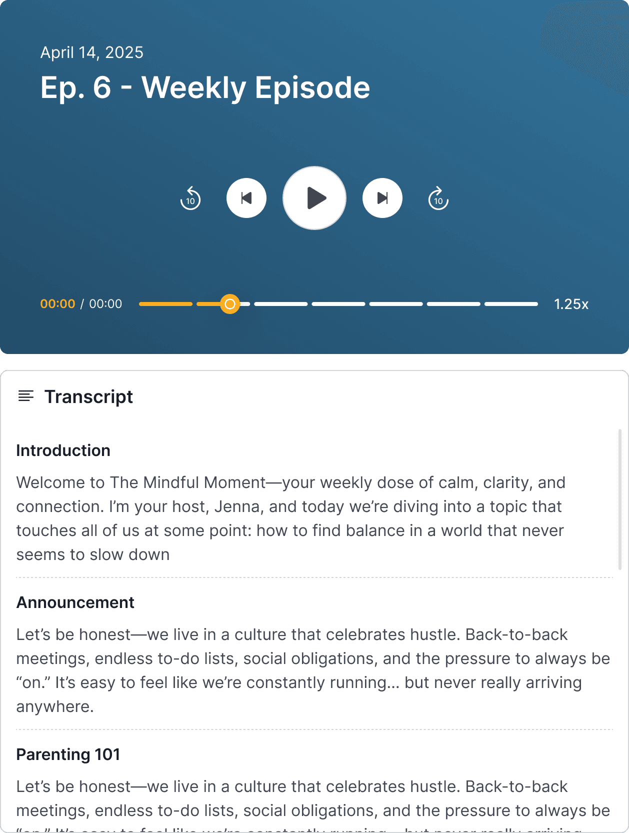
The subscriber-facing web app is where the product's value is ultimately experienced. A subscriber receives a notification, taps through, and their personalized episode is ready to play. The audio player supports speed control and scrubbing. The design is clean, warm, and content-first, optimized for people who don't think of themselves as tech users.
OUTCOME
Live, accurate, and exactly what the client envisioned
The platform launched and is actively serving real organizations. The client confirmed the product delivers precisely on their original brief, enabling leaders to record, assemble, and distribute personalized audio episodes with full visibility into who listened and when.
"The platform serves the purpose exactly as we envisioned it. Our clients can now communicate with their communities in a way that simply wasn't possible before."
Client, US-Based Communication SaaS Platform